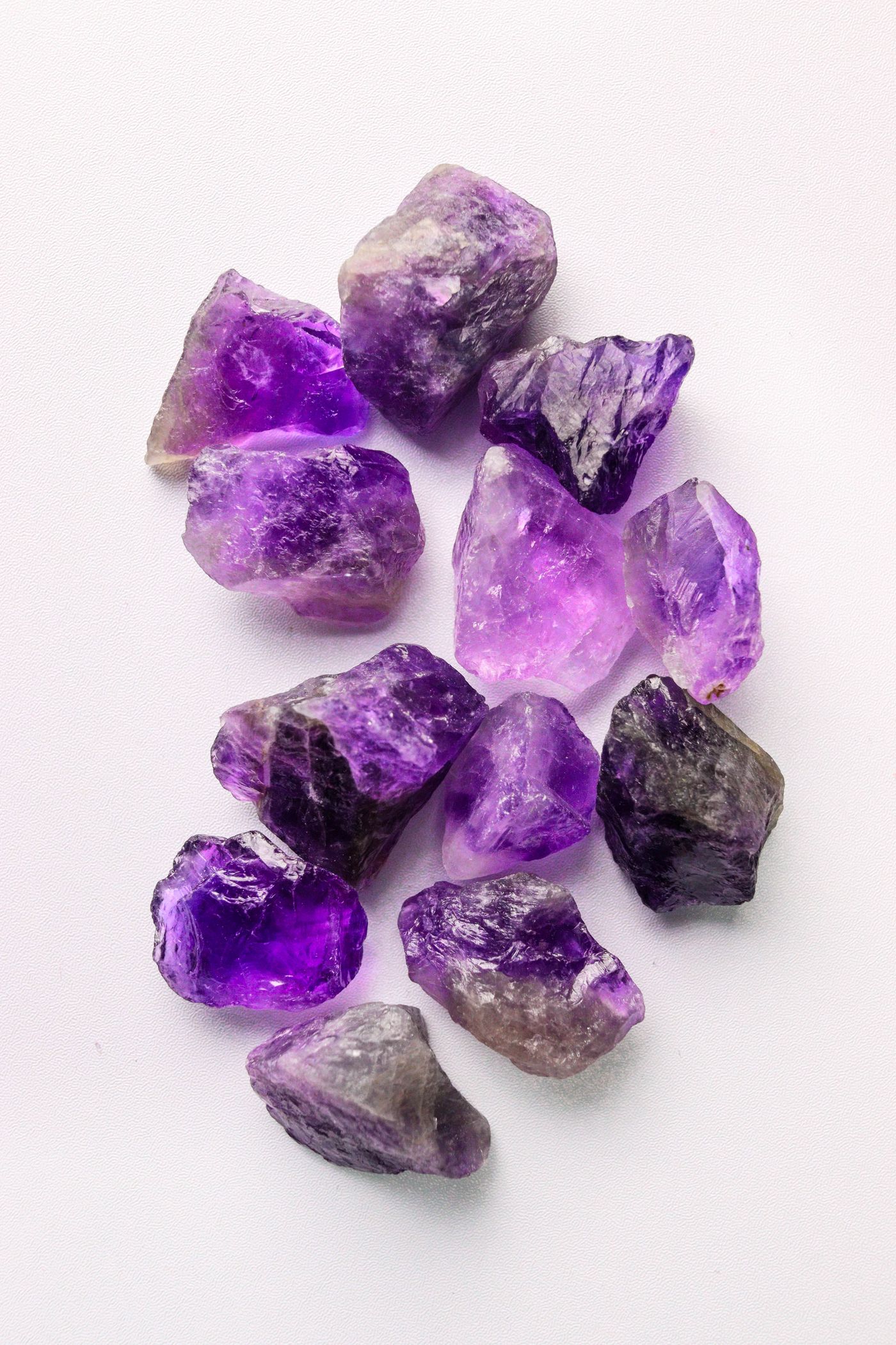
AT A GLANCE
Purple jewelry can feel quiet, graphic, or expressive depending on what surrounds it. Explore amethyst with plain shirts, knitwear, denim, dark tailoring, varied metal finishes, and carefully chosen patterns. This guide focuses on using an existing piece comfortably and repeatedly, with attention to placement, movement, occasion, and the small adjustments that turn an attractive object into a familiar accessory.
Begin with the piece you own
Styling an amethyst you already own is a different task from choosing a stone in a shop. The question is no longer which purple is most appealing in isolation. It is how this particular object can work with your clothes, routines, and preferences. Start by laying it beside several garments you wear often. Notice its actual scale, metal finish, and range of appearance. A pale pendant, a dark ring, and a strand of purple beads each ask for a different kind of visual space.
Choose one ordinary outfit as a starting point rather than an exceptional occasion look. Familiar clothes make the jewelry's contribution easier to understand. Add the piece, step back, and describe what changed. Did the outfit gain a focal point, a small color connection, or more detail than you wanted? The description does not need to be technical. It simply helps you move from the vague idea that purple is difficult to the concrete relationships that make one combination work.
Decide how visible you want the purple to be
An amethyst can function as a clear color accent or as a quieter detail discovered at close range. The surrounding garment influences which role it takes. A pale stone against a pale top may remain subtle, while the same piece against a dark background may become more distinct. A deep purple stone can look rich in one light and nearly dark in another. Choose the range you enjoy rather than expecting one constant presentation throughout the day.
Look at the outfit under the light in which you will wear it. A mirror beside a bright window gives useful information, but an evening room or office may produce a different balance. You do not need to optimize the jewelry for every possible condition. You need to know whether its ordinary variations remain appealing. If the stone becomes visually quiet indoors, that may be perfectly suitable for an everyday accessory whose meaning is partly private.
A plain white or cream shirt offers structure
A simple shirt can frame purple without requiring a complicated palette. The clean collar and cuff provide edges against which a pendant, earrings, or ring can become legible. White may create a crisp relationship, while cream can feel softer depending on the metal and stone. The important distinction is the actual fabric and finish, not a rule that one neutral always works better. Try the piece with the shirt you own rather than imagining an idealized version.
For a pendant, check where it sits between collar points and how it behaves when you sit down. A chain that looks right while standing may shift under the collar during movement. For earrings, consider whether the collar adds enough structure that a simpler shape feels more balanced. A ring can provide the purple accent without involving the neckline at all. Choosing the format that works with the garment is often more effective than forcing a favorite pendant into every outfit.
Knitwear changes the texture conversation
A solid knit can give amethyst a calm field, but the stitch pattern and thickness matter. A fine smooth knit leaves the jewelry's reflections clear, while a chunky texture introduces another kind of detail. A small pendant may disappear into a heavy stitch, whereas a larger smooth form can remain readable. This is a matter of scale rather than a reason to reserve amethyst for delicate clothing. Compare the piece at normal viewing distance.
Also consider physical contact. A setting with projecting prongs or rough fittings can catch a delicate knit, and a long pendant may move against the fabric repeatedly. If the piece has details likely to snag, wear it with a smoother garment or seek advice about the construction. Visual compatibility is only part of the relationship. The most successful everyday pairing is one you can put on and move in without continually adjusting or protecting the jewelry.
Denim can make purple feel familiar
Denim provides a useful everyday context because its texture and blue range can make colored jewelry feel integrated rather than ceremonial. A small amethyst accent beside a plain denim shirt or jacket may offer enough color interest on its own. The relationship changes with the wash: a pale blue field, a saturated indigo, and a nearly black denim each create a different contrast. Use the actual garment as the reference.
Keep the rest of the composition clear if your aim is restraint. Decorative stitching, metal buttons, a patterned top, and several accessories can all compete in the same area. You do not need to remove every detail, but decide which one leads. An amethyst ring may work more quietly than a pendant near several bright jacket buttons. Earrings may provide a useful point of color above a simple neckline. Placement can solve a problem that adding more matching pieces would only complicate.
Dark tailoring gives the stone a concentrated role
Against navy, charcoal, or black, amethyst can become a small concentrated area of color and reflection. A simple piece may be enough to make the outfit feel personal. Look at the stone's outline as well as its purple. A clear setting shape can remain visible even when the color becomes deep in low light. This allows a piece to work through silhouette and surface rather than relying entirely on saturation.
Consider the formality of the whole object. A finely set pendant, an informal bead strand, and a sculptural ring create different relationships with tailoring. None is automatically excluded, but each changes the tone. Choose deliberately rather than assuming that a gemstone name guarantees a formal effect. The metalwork, scale, and fastening contribute to the impression. A quiet object with coherent proportions can feel more resolved than an elaborate one selected only because it seems conventionally luxurious.
Warm neutrals create another kind of contrast
Camel, taupe, warm brown, and soft beige can provide an interesting setting for purple. The contrast may feel more nuanced than purple against a stark neutral, especially when the amethyst is modest in size. Look at whether the stone leans visually toward a cooler or warmer impression in that particular light. You do not need to assign a permanent undertone category to make a useful comparison. The question is whether the objects beside each other feel balanced to you.
Metal can connect or sharpen the relationship. Warm metal may echo the garment, while silver-colored metal can add another cool element. A mixed-metal piece may bridge the two. Avoid buying extra accessories simply to make every detail match. One clear relationship is often enough. A purple ring beside a warm neutral sleeve can stand on its own if the rest of the outfit allows it space.
Pattern requires attention to scale and location
An amethyst accessory can work with printed fabric when the scales and positions are considered. A broad pattern may leave room for a small stone, while a fine busy print can make a detailed pendant difficult to read. If the print already contains purple, decide whether the jewelry should echo it closely or simply relate loosely. Exact matching is not necessary and may be impossible to judge reliably from separate photographs.
Use plain areas to create boundaries. Earrings can sit above a patterned neckline, a ring can provide a small accent beside a plain cuff, or a pendant can rest over a solid underlayer beneath an open printed shirt. These arrangements allow pattern and gemstone to coexist without crowding the same field. If the result still feels busy, remove one nearby detail and look again. A single adjustment often reveals the relationship more clearly than a complete change of outfit.
Metal finish can quiet the composition
Bright polished metal adds reflections around the amethyst, while brushed or matte metal may provide a calmer frame. Darkened metal can make the shape more graphic. If you are using several pieces, finish can be a useful connection even when metal colors differ. A consistent subdued surface may create more coherence than a rigid demand that every object share one nominal color. Look at the actual surfaces together under ordinary light.
Do not polish a deliberate dark finish merely to make it match another accessory. The finish may be an intentional part of the design and may require specific care. If you want a different visual effect, first try the jewelry with another garment or a simpler neighboring piece. Styling should work with the object you have rather than casually changing its surface. Any alteration deserves a separate conversation with the maker or a suitable professional.
Repetition can be subtle rather than literal
You do not need a matching ring, pendant, bracelet, and earrings to make amethyst look intentional. A small repetition of shape, finish, or color elsewhere can be enough. Rounded earrings might relate to a curved buckle, or a silver-colored setting might connect with a watch. The repeated element does not have to announce itself. In a quiet outfit, these small relationships can provide coherence without creating a coordinated set that feels more formal than you want.
If you do own a set, try wearing one or two elements at a time. The individual pieces may gain flexibility when separated. A pendant that feels too prominent with matching earrings may work comfortably beside plain metal studs. A ring can become an everyday accent even if the full set is reserved for occasions. Treat the collection as a group of options rather than a requirement to wear every matching component together.
Scale should relate to movement
A large pendant can be visually simple yet physically active. It may swing, turn, or meet a surface when you lean forward. Long earrings can interact with hair and collars. A raised ring can catch on fabric or meet objects during hand movements. These behaviors should influence when and how you wear the piece. An everyday wardrobe is built around activities, not just still silhouettes.
Try the outfit through a short sequence of normal actions: sitting, reaching, turning the head, and putting on an outer layer. Notice which adjustments are minor and which become persistent. A different chain length, a simpler collar, or a change of jewelry format may solve the issue. If the construction itself catches or feels insecure, seek an assessment rather than treating constant management as an unavoidable part of style.
Shift from day to evening with context
The same amethyst piece can take on a different role when the surrounding clothing changes. A pendant worn with a plain shirt may become more prominent against a clean dark neckline. Earrings that are subtle with loose hair may become a clearer focal point when the hair is gathered. These changes do not require additional jewelry. They alter the visual space around the existing object and allow its shape or color to lead more strongly.
Remember that evening lighting can deepen or quiet the purple. Choose a combination whose silhouette and metalwork remain appealing even if the stone looks darker than it did in daylight. A photograph under one bright lamp may overstate how continuously luminous it will appear. The aim is a coherent range of appearances, not a promise that the jewelry will reproduce a studio image at every moment.
Keep care compatible with the routine
An accessory worn often needs a care routine that is easy to repeat. Remove it for activities likely to cause knocks, catching, or exposure to unsuitable products. Follow the maker's instructions for the complete piece, including stringing, adhesives, and metal finishes. GIA notes that amethyst should be protected from abrupt temperature changes and prolonged intense light that can affect some material. Practical storage should therefore be protected rather than decorative exposure on a sunny sill.
Keep a safe place for jewelry when you remove it during the day. A small compartment or pouch can prevent it from being placed loose among keys or cosmetics. Inspect settings and fastenings periodically without forcing them. A piece can look visually unchanged while a connector or prong needs attention. The care habit supports the styling habit: you are more likely to enjoy wearing an object when putting it on, removing it, and storing it all feel manageable.
Make meaning an invitation rather than a promise
Amethyst may have personal, historical, or contemporary symbolic associations for you. Those can enrich the experience of wearing it without becoming a claim that the stone changes health, sleep, protection, or success. A piece given by someone important can matter because of that relationship. A purple color can recall a place or a memory. These meanings do not need an external guarantee to be valid as personal interpretations.
If someone asks about the jewelry, describe the connection you actually have rather than repeating a benefit claim from a product label. This keeps the story honest and leaves room for others to respond differently. The same object can be an aesthetic choice for one person and a meaningful keepsake for another. Everyday styling does not require the private story to be visible to everyone, and a quiet appearance can carry considerable personal significance.
Build a small repertoire you enjoy repeating
Choose two or three combinations that feel comfortable and photograph them in ordinary light. Note any useful details such as chain length, neckline, or whether the earrings work better with a particular collar. These references can make getting dressed easier without turning style into a rigid system. Once the combinations feel familiar, vary one element at a time and see what changes. The process helps you learn the role of the piece rather than continually starting over.
Amethyst can become an everyday accessory when its actual character is understood: its scale, reflections, metalwork, and movement. You do not need to make purple match everything or reserve it for a special occasion. Give the piece a clear role, allow it enough space, and choose routines that support comfortable wear. Repetition then becomes a sign of usefulness rather than a lack of imagination. The jewelry earns its place through the pleasure of wearing it again.
References & further reading
References provide background and further reading. Linked organizations do not endorse or certify this publication.
For general education. The identity, treatments, construction, and condition of an individual object may require professional examination. Our editorial approach.
Back to the beginning