AT A GLANCE
Silver and silk can form many relationships, from a quiet pale palette to a strong contrast between dark cloth and polished metal. This guide focuses on visual choices rather than a universal matching formula. Explore finish, scale, engraving, necklace length, scarf borders, earring placement, and complete outfit trials to give each material a clear role while keeping the arrangement comfortable.
Decide what the pairing should do
Silver and silk are often described as a natural combination, but that phrase hides many possible results. A small silver earring beside pale silk can feel quiet, while a large polished pendant against dark cloth can become the outfit's focus. An engraved piece may invite close attention, and a bright scarf may lead from a distance. Begin by deciding the desired relationship. Should the jewelry frame the textile, should the scarf provide a background, or should the two share attention?
There is no need to answer through a fixed matching rule. The actual objects provide the relevant information: their size, shape, surface, color, and movement. A necklace and scarf can each be beautiful and still compete in one neckline. They may work well when separated by more space or paired with a different garment. Treat the combination as a design problem with several possible solutions rather than proof that one material category always belongs with another.
Read the silver finish before adding color
Silver jewelry can present a bright polished surface, a softer brushed appearance, textured relief, or deliberately darkened areas. These finishes affect how the object is seen. A polished surface may produce small bright highlights; a subdued finish may make the form or engraving easier to notice. Look at the actual piece in ordinary light. Do not assume that every silver accessory contributes the same pale reflective point or that a darker appearance is necessarily an unwanted condition change.
If a finish is described by the maker, preserve that information and follow the relevant care guidance. Styling should not lead to polishing away a deliberate surface merely to match a scarf more closely. Choose the textile around the jewelry's intended character, or choose another piece if the relationship does not work. The outfit is temporary, while an alteration to the finish may be consequential. A visual preference is best solved through selection and placement rather than an improvised treatment of the object.
Compare the silk surface as well as its hue
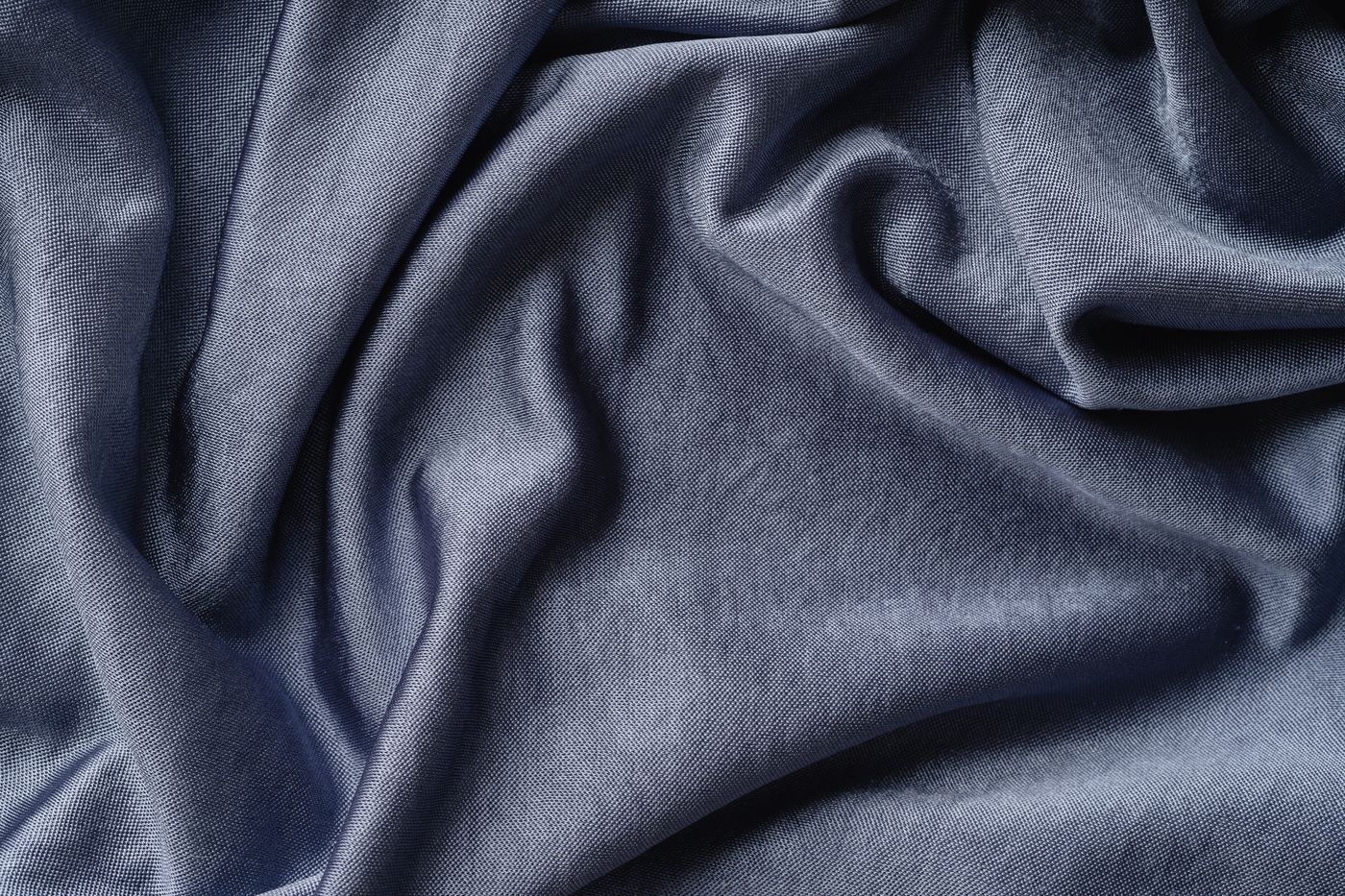
A silk scarf may be luminous, softly textured, fluid, or relatively defined in its folds. Those qualities influence the relationship with silver as much as the printed colors. Bright metal beside a highly reflective scarf can create several competing highlights. The same jewelry beside a quieter textile may become clearer. Conversely, a subdued silver finish can provide a calm point next to a scarf whose surface already carries substantial reflected light.
Try turning the cloth and jewelry together under ordinary lighting. Notice whether one disappears into the other or whether the contrast remains legible. A pairing that works only in a strong studio highlight may feel different during daily wear. You do not need to avoid multiple reflective surfaces, but their relationship should be something you enjoy. The useful question is where attention goes as the outfit moves, not whether a general rule permits shine to be combined with more shine.
Use dark silk as a clear background
Dark silk can make the outline of a pale metal piece easier to see. A pendant's overall shape may become more prominent, while small bright details can stand out sharply. This can be effective when the jewelry has a form you want to emphasize. Check the amount of contrast at a conversational distance. A large polished piece may become more assertive than expected, especially when the scarf creates a broad uninterrupted dark field around it.
If the result feels too strong, reduce the visible area of dark cloth, choose a smaller piece, or try a softer silver finish. Another option is to let earrings provide the metal accent while leaving the scarf's front clear. These changes preserve the material pairing without requiring every object to occupy the same central space. A strong contrast is not inherently wrong; it simply needs to match the role you intended. The outfit should not become dominated by a detail that was meant to remain secondary.
Let pale silk support a quieter relationship
Pale silk and silver can sit within a narrow range of lightness, making differences in surface and shape more important. The jewelry may be visible through reflection, shadow, engraving, or its outline rather than a strong color boundary. This can create a restrained effect, but it may also make a delicate piece difficult to notice. Decide whether that subtlety is desirable. An accessory does not have to be immediately prominent to contribute meaningfully to an outfit.
Try the combination with the garment that will frame it. A dark jacket can give the pale scarf and silver a clear shared field, while a pale shirt may make the entire neckline more continuous. If you want more definition, expose a darker scarf border or choose jewelry with a stronger form. If you prefer a quiet transition, keep the contrast low and let texture provide interest. The choice should respond to the complete outfit rather than a swatch of silk viewed alone.
Use a printed border as a connecting element
A scarf border can relate to jewelry through shape or contrast without matching the metal exactly. A narrow pale edge may echo a silver chain; a dark outline may make an engraved pendant more legible; a geometric border may converse with a similarly clear jewelry form. Look at the part of the scarf that will actually show. The center of a printed square may be irrelevant to the worn combination if it remains inside a folded band.
Experiment with a different starting corner before rejecting the pairing. One fold may place a busy section behind the jewelry, while another exposes a quieter field. This is a useful way to edit a design you already own. You do not need a new scarf for every pendant. The same textile can create several backgrounds, provided its dimensions and drape support the arrangement. Keep the fold comfortable and allow natural movement rather than repeatedly forcing a tiny selected area to remain perfectly fixed.
Give engraving room to be read
An engraved silver piece can contain subtle changes that deserve a relatively quiet setting. A highly detailed print immediately behind it may make both designs harder to appreciate. Try placing the pendant against a plain garment and using the scarf elsewhere in the neckline, or choose a fold that exposes a broad simple area. The aim is not to prohibit pattern mixing. It is to decide whether the engraved detail should be noticed or remain a smaller part of a more layered composition.
View the result from both close and ordinary distance. Fine engraving may be visible only nearby, while the pendant's silhouette carries the overall effect. That is a normal difference, not a reason to enlarge every element. If the piece has a documented motif or maker attribution, keep that information accurate without expecting the outfit to explain it visually. Styling can make the object legible, but it does not establish the meaning or method of every decorative mark on its surface.
Match scale through the garment opening
A pendant's scale should be considered in relation to the space created by the clothing and scarf. A large piece can look proportionate in a broad open neckline and crowded beneath a narrow collar. A small pendant may feel appropriately quiet beside a substantial scarf or become visually lost. There is no universal ideal size. Use the garment opening as the frame and observe how much of that frame the jewelry and textile occupy together.
If the arrangement feels crowded, change one element at a time. Reduce visible scarf volume, choose a different necklace length, or let earrings replace the pendant. Do not assume that buying a larger piece will solve a visibility problem caused by a busy background. More scale can simply add another competing element. A clearer field or more space may reveal the jewelry more effectively. The goal is a relationship that can be understood easily, with each object's size serving the composition rather than asserting itself independently.
Necklace length affects both visibility and comfort
The length of a necklace determines where the pendant meets the scarf and garment. A piece may sit above a folded band, below a triangular panel, or within an open neckline. Try the actual length rather than imagine it from a flat product image. Check whether the pendant repeatedly slides beneath the cloth or rests on a button. An arrangement that requires constant repositioning is giving useful feedback about the relationship between length, fabric, and garment.
If an adjustable chain is available and suitable, compare its intended positions gently. Otherwise, choose a different piece or outfit rather than improvise a fastening that was not designed for the necklace. The scarf should not be used as an anchor to hold jewelry at an exact height. Visual order is more convincing when the objects can settle naturally. A necklace that sits comfortably in one clear area will often look more deliberate than a complicated arrangement maintained through hidden tension or repeated correction.
Earrings can create a separate metal accent
When the scarf already occupies the central neckline, earrings can introduce silver without adding another object to the same space. Small forms may provide quiet points of reflection, while longer earrings can create a stronger frame. Choose according to the scarf's volume and movement. A high arrangement may reduce the clear space available near an earring, while a low loose drape may leave more room. Test the combination by turning your head, not only by looking straight ahead.
Consider whether the earrings repeat or contrast with the scarf's forms. A simple rounded shape can soften a geometric print; a clear angular form can echo a border. These are possibilities rather than rules. If the scarf is expressive, understated earrings may let it lead. If the scarf is plain, more detailed silver work may become the focus. The separation between the objects can make the pairing easier to read while preserving a comfortable amount of fabric around the collar.
Bracelets and rings complete the wider outfit
Silver does not have to sit beside the scarf to relate to it. A bracelet or ring can provide a distant echo of a pale border or a polished highlight. This may be useful when the neckline is already complete. Look at the outfit as a whole, including sleeves and the amount of visible hand jewelry. A small metal accent elsewhere can connect the materials without requiring a necklace, scarf ring, earrings, and bracelet to form a full coordinated set.
Avoid adding every matching item simply because it is available. A set may work beautifully in one context and feel excessive in another. Decide which pieces contribute distinct roles. A bracelet may be practical where a long necklace is inconvenient; earrings may remain visible when a coat covers the front. The material connection can be maintained through these choices. Coherence is a relationship between selected objects, not an obligation to display the complete contents of a jewelry collection at once.
Balance symmetry and natural movement
Silver jewelry may provide a relatively stable point while silk shifts around it. You can use that contrast deliberately. A centered pendant with an asymmetrical scarf fold can feel balanced if the visible areas have a clear relationship. Perfect mirror symmetry is not required. Conversely, a carefully centered scarf arrangement may work well with simple matching earrings. Choose the structure you enjoy and allow enough flexibility that ordinary movement does not make the outfit feel immediately wrong.
If asymmetry feels accidental, identify its cause. One scarf end may be much heavier visually because of a dark printed area, or a pendant may repeatedly drift to one side. A different fold can rebalance the visible color without making the ends equal in length. A different chain or neckline may help the pendant settle. Solve the specific relationship rather than tightening everything into place. The most successful balance is one that remains comfortable when the wearer moves, not only when the objects are arranged by hand.
Check the complete outfit in realistic light
Put on the outerwear and bag that will accompany the pairing. A coat may conceal the pendant, press the scarf upward, or make a bright earring the main visible accent. A bag strap may change where one end falls. Observe these transitions before deciding the combination is finished. The outfit's materials should work through normal use, including arrival at an indoor setting where a coat is removed and the neckline becomes more visible.
Compare ordinary daylight with typical indoor light if possible. Silver highlights and silk reflection can change their apparent relationship. Do not treat a phone photograph as a perfect color record, but use it if it helps you see the broad allocation of attention. Ask what registers first and whether that matches your intention. If not, adjust scale, visible area, or placement. The method is practical: establish the desired focus, observe the actual result, and make one clear change rather than accumulating more accessories.
Let condition support the visual choice
Inspect the jewelry for rough or damaged areas before allowing it to meet the textile. A beautiful pairing is less useful if a clasp, setting, or edge repeatedly catches silk. Keep the objects separated where necessary and seek a jeweler's assessment for suspected damage. The practical contact check should support the visual arrangement rather than dominate it. Once the surfaces and spacing are suitable, the materials can be enjoyed without constant worry about a predictable catching point.
Follow care guidance for each object separately. Do not use a silver polishing product near a scarf or store treated metal against the cloth. Do not assume that a method intended to improve one material is appropriate for the other. Remove and store the pieces separately after wear, preserving the outfit combination through a note or photograph if desired. Their visual relationship belongs to the wearing arrangement; direct physical contact is unnecessary during storage and can introduce pressure or transfer risks.
Build a few pairings you understand
Choose two or three combinations that work with familiar clothes and identify why they succeed. One may use dark silk to clarify a pendant's outline; another may pair pale cloth with subdued silver for a quieter effect; another may let earrings provide the only metal accent beside an expressive scarf. These observations create a useful vocabulary for future dressing. They are more adaptable than a claim that silver always matches a particular color or weave.
Let the actual objects remain specific. A scarf's fold, a pendant's finish, and a garment's opening can change the whole relationship. Test them through movement and realistic light, keep care and contact sensible, and allow one material to lead when clarity requires it. The pairing then feels considered because its choices can be seen and understood. Silver and silk do not need an elaborate story to work together; their surfaces, proportions, and colors can create enough interest when given a clear place in the outfit.
For general education. The identity, treatments, construction, and condition of an individual object may require professional examination. Our editorial approach.
Back to the beginning