AT A GLANCE
Purple is only the start of an amethyst comparison. Explore light and dark areas, face-up appearance, cutting choices, settings, photographic limitations, and the difference between a seller's quality label and an independent standard. This guide helps you select a piece for its actual wearing character while keeping treatment, identity, and origin claims in their proper place.
Purple has more than one character
Amethyst can appear delicate, saturated, luminous, muted, or almost dark enough to lose its purple identity in some lighting. That range is part of its attraction. A shopper who begins with only the instruction to choose the deepest color may overlook the way a stone behaves on the body. A rich pendant that looks compelling near a window can become a dark patch against a sweater in an evening room. A lighter stone may remain visibly purple in the same setting.
There is no need to turn this into a contest between pale and dark. Begin by deciding what you want the jewelry to do. Should it provide a quiet accent, a recognizable purple focal point, or a contrast with a particular metal? Will you wear it mostly indoors, outdoors, or after dark? Those questions connect color to use. They also prevent a retailer's most impressive close-up from defining a preference you have not actually tested in your own surroundings.
Compare face-up appearance first
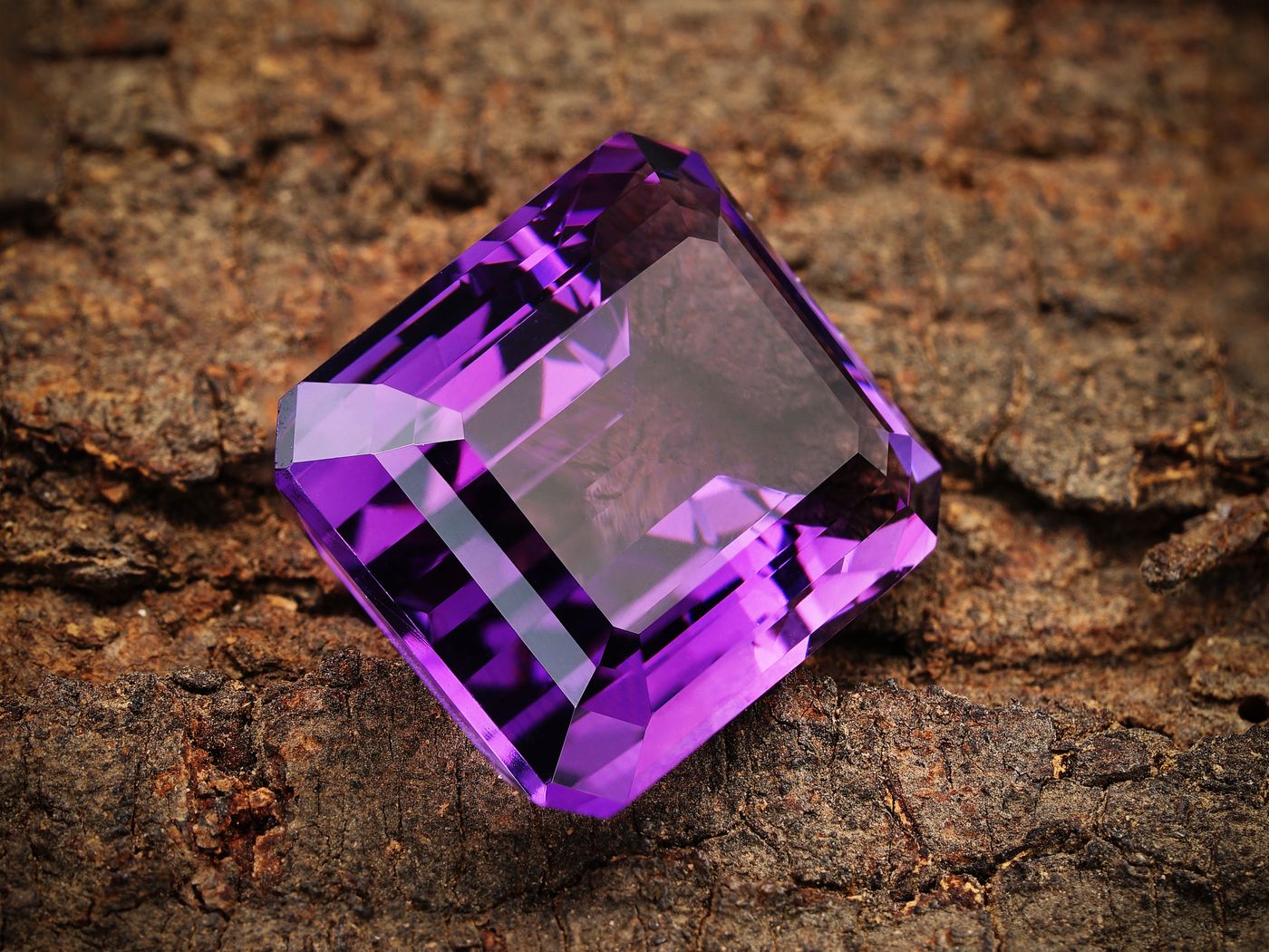
The face-up view is the appearance of a fashioned stone as you normally see it from the front. For a ring, that means looking down toward the hand; for a pendant, it means seeing the piece upright. A side view can be beautiful but may not represent the color and light pattern visible during wear. Ask for the orientation that matters to the object. A pendant photographed flat on a bright white surface may look different when it hangs against clothing.
Move beyond one perfectly positioned photograph. A short, steady video can show how the stone changes with angle, although it still depends on lighting and camera settings. Notice whether areas go dark together, whether a pale central region remains obvious, and whether the color appears concentrated near the edges. These observations can help describe appearance without claiming to diagnose the exact cutting or geological cause. If a feature concerns you, ask the seller to show it under another light rather than assigning a confident explanation remotely.
Look for a useful balance of depth and visibility
A strongly colored stone can be appealing, but darkness is not identical to attractive saturation. Under some conditions, a stone may absorb or return light in a way that makes much of its face appear nearly black. If you want a clearly purple accessory, that may be less satisfying than a lighter option. Conversely, a very pale stone may not create the contrast you want beside a bright metal. Compare the whole object at normal viewing distance instead of judging a single magnified facet.
Try to see the candidate in both diffuse daylight and ordinary indoor light. You are not looking for an object that never changes; all reflective materials respond to their surroundings. You are learning whether the range of appearances suits your preference. If the seller can show two stones together in the same frame, that is often more informative than separate images with different exposures. Treat screen-based comparisons as approximate and give special attention to the return terms when a precise shade is essential.
Cutting creates a pattern of light
The cut influences how a faceted amethyst presents its color and reflections. Shape, proportions, and the arrangement of facets all contribute to what you see. A broad cushion, a long oval, and a small round stone can express purple differently even when their underlying material looks related. Do not assume that one outline is inherently finer. Consider whether the cut creates a balanced face-up pattern and whether its proportions fit the design in which the stone will be worn.
Ask for dimensions as well as weight. Two stones of similar weight may occupy different visual areas, and a deep setting can make a pendant project farther from the body than expected. A ring may sit high enough to catch on clothing even when the stone appears modest from above. A ruler photograph, side view, and on-body image help translate a retail specification into a physical object. The best-looking face-up photograph cannot answer every question about height, profile, and practical presence.
Color zoning needs context
Amethyst can show areas of different color intensity. The visibility of those areas in a finished stone depends on the material and the way it is fashioned and viewed. An obvious band or patch may be part of what you enjoy, or it may distract from the even appearance you prefer. The useful question is not whether every visible difference is unacceptable. It is whether the actual appearance matches the description and suits the intended design.
Request an image of the exact item if a particular pattern matters. Representative photographs are common in jewelry listings, especially for repeated designs, but they cannot promise the same distribution of color in every stone. If the listing offers a range, ask how the supplied item is selected and what variation is expected. A clear answer allows you to choose knowingly. An unusually uniform image should not be treated as proof of natural origin, and visible zoning should not be treated as a complete authentication method.
A setting changes the surrounding impression
Metal color, the depth of the mounting, and the amount of open space around the stone all affect the overall impression. A pale purple amethyst in a broad polished frame can read differently from the same-sized stone in a delicate open setting. Warm metal can create one contrast, silver-colored metal another, and a darkened surface another again. These are relationships to evaluate visually, not universal rules about which pairing is correct for a particular person.
Look at the entire piece rather than mentally removing the stone from its frame. Ask whether the setting supports the intended effect or competes with it. A large decorative mounting may dominate a softly colored center, while a very fine setting may leave a substantial stone feeling visually unbalanced. Side and back photographs reveal how the stone is held and how the object will sit. A front view that makes the color attractive should be supplemented by construction information, especially for rings intended for frequent wear.
Understand retail quality labels
Letter grades and words such as premium can be useful within one seller's own selection system, but they should not be mistaken for a universal independent scale. GIA's amethyst guidance explains that no standard quality-grading scale exists for amethyst. Ask the seller what a stated grade means in that listing. Does it refer to color, clarity, cut, matching, or a combination? A clear internal definition is more helpful than an impressive label whose criteria remain unstated.
Do not compare two retailers' letter grades as though they necessarily describe the same threshold. Compare visible appearance, measurements, construction, disclosed treatment, and the evidence behind any important claim. If a higher-priced category differs mainly in a quality you do not personally prefer, you may not gain much by choosing it. A carefully selected lighter piece can be the right design choice without needing to be relabeled as the highest grade. Preference and market terminology are related but distinct considerations.
Treatment belongs in the description
Ask what is known about treatments for the individual item, and avoid assuming that an attractive color proves an untreated history. A seller may have information from a supplier, a report, or their own records; they may also have limited knowledge. Those situations should be stated accurately. A broad phrase such as genuine amethyst does not necessarily answer every question about treatment or origin. Request separate answers when those claims materially affect your purchase.
Treatment disclosure also helps with care. A finished piece may have fractures, fillings, coatings, adhesives, or other features relevant to cleaning, even if a general guide describes amethyst as suitable for many jewelry formats. Do not conduct home experiments with heat, solvents, or scratching to resolve uncertainty. A professional examination may be appropriate if the identification or treatment claim is consequential. For a modest accessory, a transparent description and sensible expectations may be more proportionate than expensive testing, but transparency still matters.
Natural origin is not established by a photograph
An online image cannot conclusively distinguish every natural, laboratory-grown, treated, or imitation material that might resemble purple quartz. A convincing color, a visible inclusion, or a familiar shape is not a complete identification procedure. Ask for a clear material representation in writing. If documentation is provided, check what it identifies, whether it applies to the actual item, and whether the issuer can be verified through an appropriate route.
Do not let a report's existence replace reading it. An identification report is different from a valuation, and neither automatically tells you that a piece is the best choice for your life. Ask whether any origin claim has a stated evidential basis. Geographic storytelling can add atmosphere to a listing, but atmosphere is not documentation. If a premium depends on a specific source, the description should make clear how that source is known and what uncertainty remains.
Think about the wearing format
A pendant is viewed largely from one side and may be protected from some contacts by its position. A ring is exposed to more frequent knocks and surfaces. Earrings must be considered as a pair, including matching, weight, and the way each stone faces the light. A bracelet combines multiple stones with stringing or links that have their own maintenance needs. The same purple appearance does not make all these formats equivalent in comfort or care.
Choose scale according to the object as a whole. A large amethyst earring may be visually elegant yet too heavy for your preference. A tiny ring stone may provide exactly the subtle accent you want even if it does not reproduce the drama of a macro photograph. Ask for total weight and dimensions where relevant. If you are comparing earrings, request a view of both together under the same light rather than one attractive stone photographed twice from different angles.
Plan care around the actual piece
Amethyst is a quartz variety, but durability should not be reduced to one hardness number. Scratching, impact, heat, and the security of a setting are different concerns. GIA advises avoiding abrupt temperature changes and notes that prolonged intense light can affect some amethyst color. In practical terms, do not leave jewelry on a hot windowsill, use heat to clean it, or assume that a bright display location is the best long-term storage arrangement.
Follow care instructions for the complete piece and use cautious cleaning methods. A warm, gently soapy cleaning approach suitable for a particular stone may still be inappropriate for an attached cord or adhesive. If the construction is unknown, ask before immersion. Store pieces separately to reduce rubbing and inspect settings periodically without forcing them. A purple stone that looks unchanged can still be at risk of loss if a prong, bail, or clasp has worn or loosened.
Make a comparison record
When several candidates blur together, write one sentence about each without using a ranking word. Describe the dominant purple, the visibility of light and dark areas, the scale, and the setting. Then add the practical details: dimensions, total weight where useful, exact or representative item, treatment information, and returns. This separates observation from marketing and makes it easier to see which differences actually matter to your intended use.
If you are shopping for a gift, include the recipient's preferences rather than assuming that a richer color is always more desirable. A person who wears quiet neutral clothing may enjoy a pale accent; another may want a saturated statement. Symbolic associations can be included as personal meaning, but avoid presenting amethyst as a medical aid or a guaranteed source of calm, protection, or success. The color and craftsmanship are sufficient reasons to choose it without attaching an unsupported promise.
Choose the appearance you will actually see
A thoughtful amethyst purchase balances attraction with information. You do not need to become a gemologist to ask for ordinary lighting, useful dimensions, a written description, and a view of the construction. Those requests help you understand the object rather than merely collect reassuring adjectives. If a claim cannot be substantiated, leave the uncertainty visible in your decision instead of filling it with an appealing story.
The most satisfying piece is often the one whose range of appearances you enjoy. It can be pale or dark, faceted or smooth, modest or substantial. What matters is that the purple works with the setting, the object works with your life, and the representation does not exceed the evidence. Looking beyond a single perfect photograph gives you a better chance of selecting jewelry that remains appealing after the package is opened and the ordinary light returns.
References & further reading
References provide background and further reading. Linked organizations do not endorse or certify this publication.
For general education. The identity, treatments, construction, and condition of an individual object may require professional examination. Our editorial approach.
Back to the beginning