AT A GLANCE
Tiger eye rewards looking slowly. This guide explains how a moving band of reflected light changes across beads, cabochons, and pendants, why lighting matters when comparing pieces, and which observations belong to appearance rather than identification. Learn to ask for useful photographs and judge a design without mistaking a dramatic image for proof of quality.
A material that changes when you move
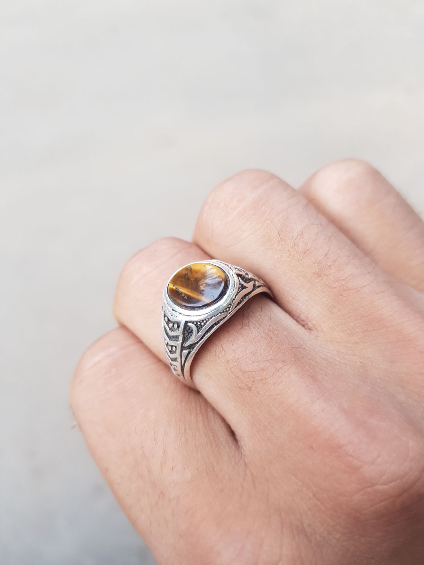
The most persuasive introduction to tiger eye is a small movement. Turn a polished bead near a lamp and a golden region may seem to travel across its brown surface. Turn it back and the brighter area returns. The effect can look surprisingly deep, as though light were sliding beneath the polish. It is an optical response to the relationship between the material, its orientation, the light, and your viewing position. It is not a sign that a stone is producing light or releasing energy.
That distinction helps when selecting jewelry. You are choosing a visible material effect within a wearable object. A bracelet that looks theatrical under a display spotlight may be quieter beside an office window. Neither appearance is dishonest by itself. Problems arise when one carefully chosen image is presented as the only appearance the wearer will see. A useful evaluation therefore considers several lighting conditions, the whole construction, and whether the changing effect suits the way you intend to wear the piece.
What chatoyancy describes
Chatoyancy is the term used for the directional, silky reflection associated with tiger eye. Its appearance relates to aligned fibrous mineral structures within the material. Describing that effect as a moving band is often more useful to a shopper than treating it as a mysterious property. The band is an observation you can make, while determining exactly what a particular specimen contains requires appropriate gemological examination. Contemporary mineral research also reminds us that a simplified retail explanation is not a substitute for the full geological story.
On some stones the bright region is broad and soft. On others it is narrower, stronger, or divided by darker areas. The direction of the internal structures and the way the piece was cut influence what becomes visible. Not every attractive piece needs a razor-sharp central stripe. A broad shimmer may suit a low, rounded bead better than a dramatic line would. The practical question is whether the effect is coherent and pleasing across the finished surface, rather than whether it imitates the most striking photograph you have seen.
Direction matters more than a single still image
Imagine a pendant resting flat on a table. A photograph taken from above may show a strong golden band. When that pendant hangs upright against clothing, its relationship to overhead lighting changes. The effect may remain obvious, become subtler, or appear only when the wearer moves. This does not automatically indicate poor cutting. It does mean that a tabletop image cannot describe every wearing condition. A short video showing the pendant upright can answer questions that another close-up photograph cannot.
For a bracelet, movement is even more complex. Beads follow the curve of the wrist, so they face different directions simultaneously. Expecting every bead to display the same bright stripe at the same instant sets an unrealistic standard. A well-considered strand can show a rhythm of light and dark rather than uniform illumination. When looking at a video, watch whether the changing appearance feels intentional across the bracelet. Also notice whether one particularly dramatic bead has been placed nearest the camera while the remainder stays hidden.
Comparing light sources fairly
A small, directional lamp tends to emphasize directional reflections. Broad, diffused daylight can produce a softer impression. Strong sunlight introduces glare and deep shadows, while warm indoor lighting can make golden tones seem richer. These differences are part of viewing any reflective object, but they matter especially for a material whose appeal includes a moving optical effect. Ask for at least one image in diffuse daylight and one ordinary indoor view before forming a strong conclusion about a remote purchase.
Try to compare candidates under similar conditions. Looking at one bracelet under a jewelry counter spotlight and another in a dim bedroom tells you as much about lighting as it does about the stones. If the seller can show two pieces together in the same frame, that can be more informative than separately edited images. A neutral background and a steady camera help, although they do not establish exact color accuracy. Screen settings, automatic white balance, compression, and exposure can all alter your impression.
Reading the surface without confusing it with the effect
The optical movement beneath the surface and reflections from the polished surface are different observations. A broad white patch may simply be a lamp reflected from the exterior. Move the piece slowly and notice whether the white glare hides the material beneath it. A photograph filled with white reflections can make surface inspection difficult even when it looks luxurious. You should be able to see at least some areas without glare if you are being asked to judge polish and condition.
Look for interruptions that remain fixed while the light changes. These may include scratches, pits, uneven polish, or other features, but a remote image rarely supports a confident diagnosis. Request a closer view rather than assigning a geological explanation. Around drilled holes, assess whether edges look smooth and reasonably finished. A vivid band does not compensate for a rough hole that abrades cord. In a pendant, examine the perimeter and setting as carefully as the center of the cabochon.
Beads, cabochons, and flat shapes behave differently
A rounded bead presents many surface directions within one small object. As it turns, several parts can catch and release light. A domed cabochon offers a larger continuous viewing area and can display the changing band in a more concentrated way. A flatter plaque may create a quieter effect, especially if its orientation does not favor the lighting around it. None of these forms is automatically superior. They create different visual experiences and place different demands on the maker.
Think about scale alongside shape. A large pendant gives the optical effect room to develop but also creates a stronger visual focal point. Small beads produce a repeating pattern, which can read almost like a textile beside a plain sleeve. A wide cuff may look substantial even if its stone sections are thin. Before choosing by the apparent strength of the shimmer, establish the dimensions of the finished object. Millimeter measurements and a photograph on a person are more dependable than an isolated macro image for understanding presence.
Matching and variation within a strand
Natural-material jewelry often balances repetition with variation. A tiger eye bracelet can be matched for overall tone while allowing individual bands to differ. Alternatively, a designer may emphasize contrasting areas deliberately. The relevant standard is the stated design, not an assumption that every bead must be identical. Ask whether the photographs show the exact bracelet or a representative example. If a strand is assembled after ordering, the pictured distribution of light and dark may not be reproducible bead for bead.
For a restrained design, examine the bracelet at normal viewing distance. An image magnified until one bead fills the screen can exaggerate both its drama and its imperfections. Place the photograph beside an image showing the whole wrist. Do the beads read as a coherent warm accent, a striped statement, or a heavy visual border? That larger impression matters more in daily dressing than microscopic differences that disappear at arm's length. A visually balanced strand need not contain the most intense individual bead available.
What observation cannot authenticate
A moving silky band is useful descriptive evidence, but it is not a complete identification test. Different materials and manufactured products can display directional optical effects. A video can show that something changes with angle without proving the material name, natural origin, treatment status, or geographic origin. Avoid reducing identification to a checklist of visual tricks. The more consequential the purchase, the more important it becomes to rely on a clear written description and, when justified, a qualified independent examination.
Do not scratch, heat, strike, soak, or chemically test jewelry at home to prove a listing correct. Such experiments can damage the object, its mounting, or its stringing and still produce an ambiguous result. A reassuringly cool feel, a satisfying weight, or an apparently natural-looking pattern does not resolve every identification question. If you need a laboratory report, ask what the report actually covers and whether it refers to the individual item. A seller's general statement about a batch is different from item-specific documentation.
Questions that produce useful answers
Instead of asking only whether the tiger eye is high quality, ask what you need to know. Is the item shown the exact item supplied? What are the bead diameter, bracelet inner circumference, pendant dimensions, and total weight? Is any color treatment disclosed? What metal, cord, or elastic is used? Can the seller provide a short, unfiltered video in ordinary lighting? These are questions that connect directly to fit, appearance, construction, and expectations rather than inviting an unsupported superlative.
Keep the response with the order record. Written descriptions are particularly helpful when color names are impressionistic. Golden brown, red brown, and blue toned are visual descriptions; they do not, on their own, document how a color arose. If a seller does not know treatment information, that uncertainty should remain visible in your decision. It is reasonable to choose an inexpensive decorative piece with limited documentation, provided the uncertainty is not disguised as certainty and the price does not depend on a stronger claim.
Styling the changing light
Tiger eye often works well when the rest of an outfit gives its surface enough visual space. A plain knit, a clean cuff, or a solid shirt can let the striped reflection remain legible. This is a design suggestion rather than a rule about who should wear particular colors. If you enjoy pattern, compare the scale of the clothing pattern with the scale of the beads. Two small, busy repeats can merge visually, while a broader textile pattern may leave the stone's own rhythm easier to recognize.
Metal choices alter the surrounding impression. Warm metal can echo the golden reflection; cooler metal can introduce contrast; darkened components can emphasize the brown portions. Consider finish as well as color. A highly polished clasp may compete with the optical effect, while a brushed fitting may act as a quieter frame. These relationships are easiest to judge on the whole object. A technically impressive stone can still feel wrong in a setting whose weight, proportion, or surface finish does not suit your wardrobe.
A simple comparison session
If you are choosing between two pieces in person, give yourself a repeatable viewing sequence. Start with both objects resting on the same plain surface, then bring them upright without changing the lamp. Rotate one slowly, return it to the starting position, and repeat with the other. Finally, place each at the distance from which you would normally see it on the body. This sequence is not a gemological test. Its purpose is to prevent a fleeting bright flash from overwhelming your assessment of the complete design.
Write a short description without using a ranking word. You might note that one pendant has a broad, warm reflection and a quiet edge, while another has a narrow bright band and more contrast across its face. Add a separate note about fit and construction. Only after recording those observations should you decide which qualities matter most to you. This makes personal preference explicit and avoids treating the most intense reflection as an objective winner in every context.
For an online comparison, ask for the same movement and the same framing from each seller when possible. If comparable images are unavailable, acknowledge the resulting uncertainty instead of mentally correcting one photograph to match another. The return arrangement then becomes part of the evaluation. Check the period allowed for inspection and the condition in which the jewelry must be returned. Trying on an item gently at home under ordinary lighting is different from wearing it extensively before deciding. Clear expectations protect the usefulness of the comparison and reduce disappointment for everyone involved.
Living with the piece
Once the jewelry is yours, learn its ordinary appearance before judging it against a sales image. Look at it beside a window, under the lighting where you work, and with the clothes you wear most often. That small exercise establishes a realistic baseline. It also makes later changes easier to notice. A dusty or oily surface can obscure reflections, while wear on a clasp or elastic changes the experience of the object even if the stone itself looks much the same.
Use care instructions appropriate to the complete piece. A material that tolerates a gentle wipe does not make every adhesive, finish, or thread suitable for soaking. Store the jewelry so harder neighboring objects cannot rub against it, and avoid dropping it onto hard surfaces. The enduring appeal of tiger eye lies in a conversation between structure and light. Choosing it thoughtfully means enjoying that conversation while remaining clear about what you can see, what you can reasonably compare, and what still requires specialist knowledge.
References & further reading
References provide background and further reading. Linked organizations do not endorse or certify this publication.
For general education. The identity, treatments, construction, and condition of an individual object may require professional examination. Our editorial approach.
Back to the beginning